Showing posts with label colour. Show all posts

Tuesday, 7 May 2019

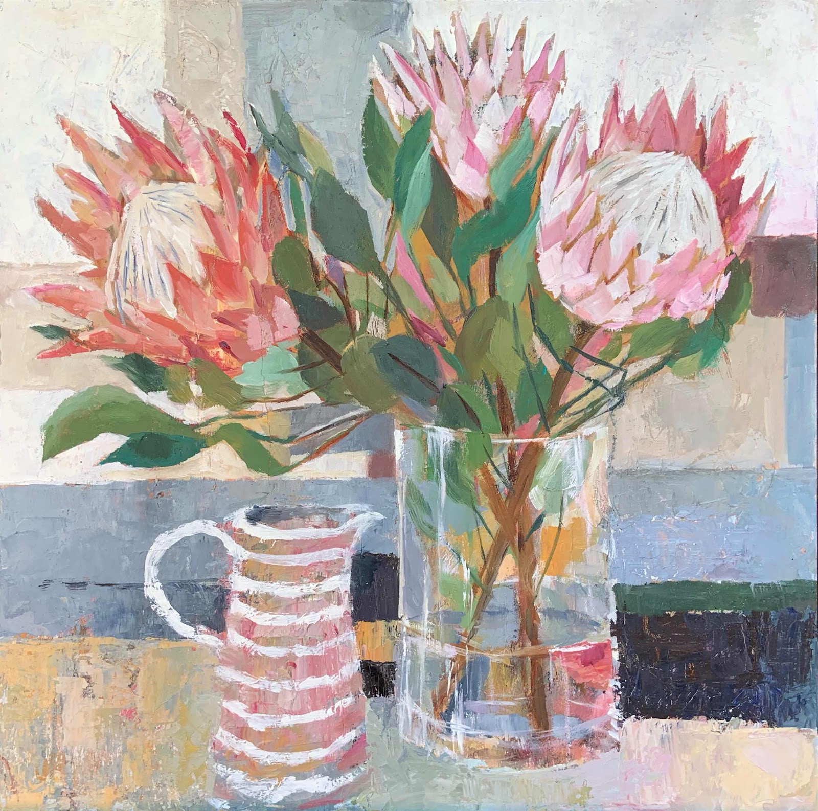
Proteas with a Jug at Rotary Art Spectacular 2019


Proteas with a Jug - oil and cold wax on panel 40 cm x 40 cm 

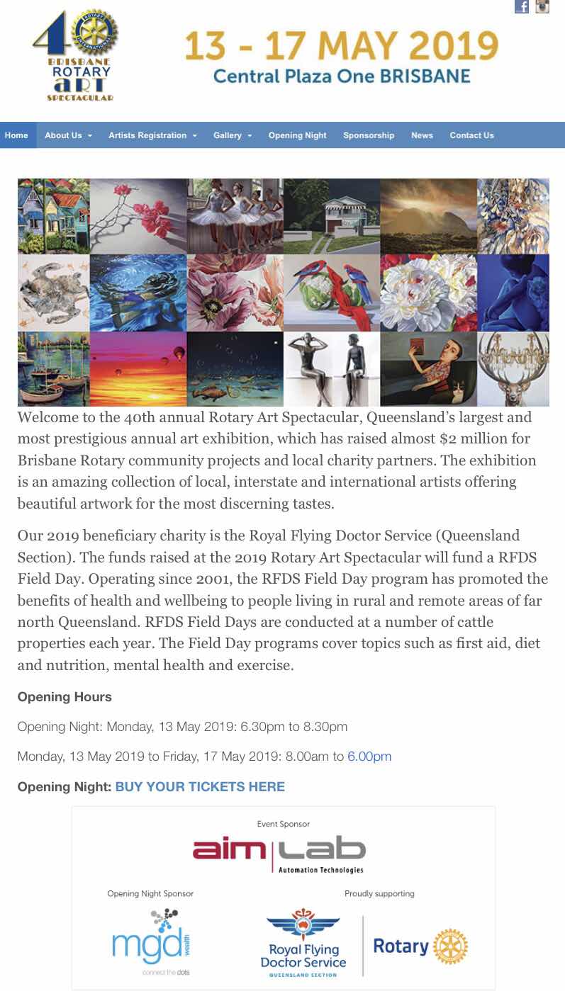
I am delighted that this little painting will be part of the Rotary Art Spectacular 2019. The exhibition opens on Monday evening - details below in a screen shot from the website.

I have written about the process of this painting in an earlier post which you can find here. I so enjoyed painting it and am so pleased with the result - I just love the colours. It’s really satisfying when everything just “works”. Although as you will have read in the post there were a few obstacles along the way.

Two more of my paintings are part of the Online Exhibition. There were so many entries this year so I am happy to have a painting selected to hang in the show. Once the online catalogue is on the website I’ll add a link here.
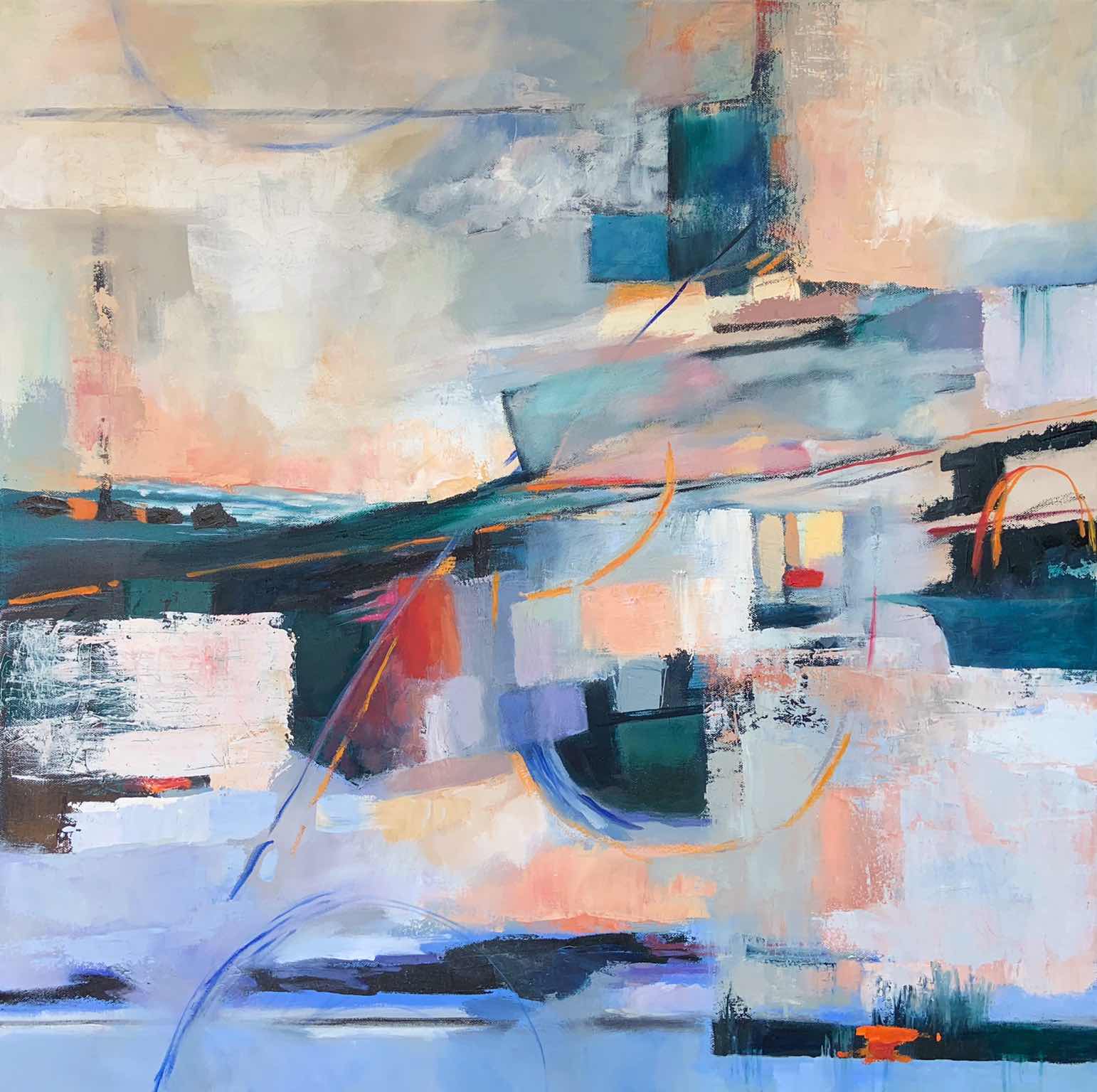


Transition - oil and cold wax on canvas 90 cm x 90 cm 

Digital Painting


Over the last couple of years I have become more and more fascinated wit h digital painting. I still have a lot to learn and try to expand my use of new digital brushes with each new painting. This painting started out as an oil painting on canvas. It had been started some time ago and then left while I went on to paint other images. I hauled it out of storage to re-work it and complete the painting. Photographing work in progress provides a way to assess the quality. I loaded this photograph to Procreate and then I realised that since the entries for the Rotary Exhibition were now open to digital images there was nothing to stop me submitting a digital painting. 
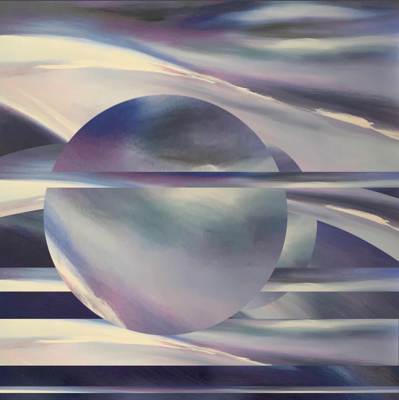


Time and Space - digital painting - suggested size: 60cm x 60 cm. 

Since this is a digital print on archival paper, the size can be altered to suit your requirements. Alternatively the painting can be printed on to a stretched canvas and would then require no framing. 


Thursday, 13 September 2018

Colour - A Practical Approach Part 2


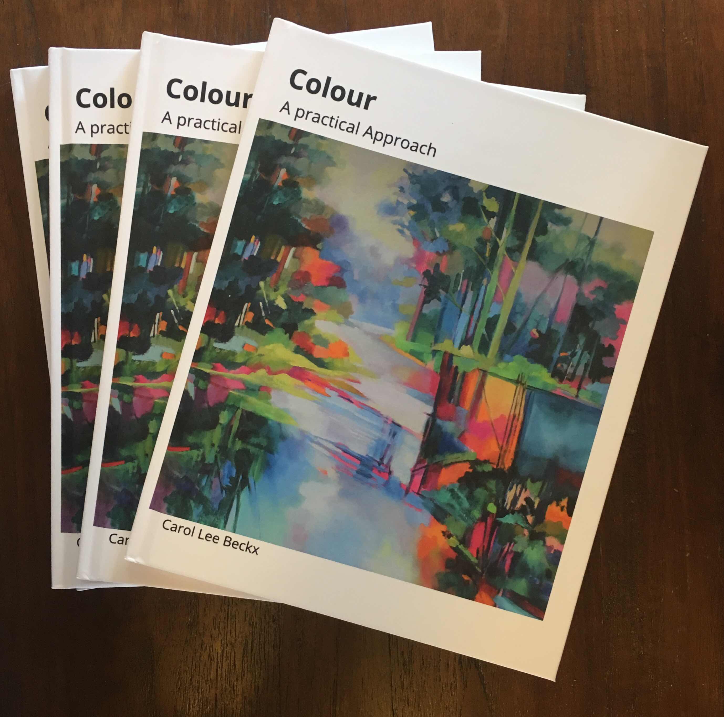
Such exciting times - the hard covered copies of my book Colour - A Practical Approach arrived today! It’s so rewarding to see the results of months of writing and re-writing, painting illustrations, selecting photographs of paintings and then editing and re-editing. Click on the link to see a preview. The book is available in both hard and soft cover and an affordable EBook. 


The book is a no-fuss practical handbook to be a companion to painting in the Studio. The colour wheel is explained and illustrated along with notes on complementary colours. I have a few colour “rules” to keep you on the right track and there are also chapters with basic tips for mixing paint.  There are suggestions for the arrangement of paint on the palette to help develop a more organised approach.


There are twenty colour exercises to work through. These cover many aspects of colour mixing. I suggest doing these in a dedicated colour sketchbook so you will have a comprehensive personal reference book at the end.

Many artists work from photographs so there is also a chapter on how to make the most of this resource. Step by step photos of my own paintings will give you some insight to my process of working form photos.


Finally, a book like this would be lacking without some explanation of the terminology of art. A comprehensive glossary sheds light on some of these mystifying terms. 

Wednesday, 12 September 2018

Colour - A Practical Approach - Part 1

My new book Colour - A Practical Approach  has been published. When you click on the link you will be able to see a preview. It’s the culmination of a year’s work. The idea originated from a request from one of my Studio classes for more intensive colour studies, particularly on mixing colour. 


.

I began by making notes; collating information that had been used during colour workshops held over the last few years. These notes took shape and became quite extensive. When I realised that text with no illustrations would not be very effective, it was a logical decision to write a book instead.

Previously, I had taken an online course, By Design, with the artist and teacher, Roz Stendhal. The course covered the fundamentals of page layout and design for working with both handmade and digital pages so I was ready to try writing my book.

At the time I had a brief foray into working with Adobe’s InDesign. It soon proved to be a stretch to learn the programme since I wasn’t working with it regularly enough. Then I discovered that Blurb, a self-publishing company with a very good reputation, offer Bookwright software obtainable as a free download. It was the solution to my problems. The software is easy to use, offers hints and tips like - the resolution of this image is too low - reduce the size or replace. There are numerous set formats to use. alternatively one can self-design each page. 

There are a number of different kinds of books - Photo books, Trade Books and Magazines, each with a different focus and  price point. After watching a webinar on the Trade Book it was the best option for me. It would provide the best format, 8” x 10” and could be printed at an affordable cost. In addition, and Ebook could be published using the same format text and illustrations and easy and good value option for anyone anywhere in the world. 

I was excited to see how the book would look, to check the paper quality and the colour accuracy of the photographs so I ordered a single copy. Once I had the book in my hands, I realised that there needed to be more - more detailed information, more chapters, and more colour exercises. There were also a few layout issues with the Ebook which needed to be corrected. 

So it was back to the writing desk. 

Fast forward a year after the first draft, the new, updated extend, and largely re-written book has been published. 
Colour - A Practical Approach is available from Blurb in the following options - Soft cover, Hard cover and Ebook. 

More details to come in Part 2.

Thursday, 28 August 2014

Nasturtiums in Watercolour

In one of the classes in my Studio we have been looking at Still Life - and painting from life too. It makes such a difference when you really look at something; examine the shapes; enjoy the colours; and appreciate the light shining through petals on a flower.

Nasturtiums I ink and watercolour Alpha Sketchbook

I prevailed on one of the artists to leave her beautiful nasturtiums for me to paint over the weekend. Since I have a new colour - Schmincke Translucent Orange - it seemed fitting to use watercolour. 


Nasturtiums II ink watercolour Alpha Sketchbook

                                     Nasturtiums III watercolour Alpha Sketchbook


I enjoyed trying a few variations - ink then watercolour; watercolour on its own for quick, free flowing colour; and lastly a more careful painting. I planned to add a few more shadows however life got in the way and when I looked a few days later, the flowers were past their prime. Life is fleeting.

 I found a delightful poem to complete the page.

Monday, 31 December 2012

Where did 2012 go?

Highlights of my creative year...

Exhibitions

Limited edition Sketchbook Project - completed and posted by the January deadline!

Workshops

The Workshop component of my teaching was extremely fulfilling with the following topics covered:

  • Discover Drawing;
  • Colour - going back to basics;
  • Abstract Art;
  • Composition,
  • Line & Colour with Derwent
2013 will see these workshops continue. I plan to include more topics and offer some one day workshops in my studio each term.

Commissions

2012 has been a very good year for commissioned paintings:


April - Memory Wall


Memory Wall - oil on canvas - 40 x 8" x 8"

May - Paintings for city apartment in Brisbane


September - Deja Bru Cafe
Paris - Deja Bru Cafe - acrylic on linen - 3 x 144" x 144"
October - Wearable Art Hairdressing

Pink Roses with Mirrors - oil on canvas - 1000mm x 1000mm
Plans for 2013

Now that my teaching studio has become more established, I can turn to my personal creative development. Drawing has become part of my artistic practice. I intend using my journals to experiment with mixed media and develop new ways to express ideas and themes that are important to me.

Moving out of the studio is something I would like to do. I need to plan how and where to paint so that is first on my list. Initially, with the heat of Brisbane summer at its highest, I might need to search out a couple of cooler places! (But at least I don't have to contend with snow!)

To my readers in all parts of the world - thank you for visiting Art Matters, it's so encouraging to see the number of visitors growing.

My wish for you this coming year is that you will have happy times with family and friends, good health, and may the creative muse remain by your side all year long...


Wednesday, 14 November 2012

Workshops and Free demonstrations


This is my schedule of workshops and demonstrations for the next few weeks.

Art Shed Brisbane
Sunday 18th November 10.00am - 3.00pm

Workshop: Line and Colour with Derwent (For details click this link)
Please sign up at  Art Shed Brisbane 
Tel: 38461330 
274 Montague Road, West End

Abstract Rose - Sketchbook study - Derwent Artbars 

Arthouse Northside:
Composition - 3 week course
Fridays:  9th 16th and 23rd November 9.30am -12.30am
(It’s not too late to join the class this week.)
Please sign up at Arthouse Northside  
Tel: 38692444 
140 Braun Street Deagan 4017

Portofino - oil on canvas - 900mm x 900mm ©2012 Carol Lee Beckx

Arthouse Northside:
Friday 16th November 1.00pm - 2.00pm
Free Demonstration: Colour

Friday 23rd November 1.00pm - 2.00pm
Free Demonstration: Brushes - types of brushes for watercolour, acrylics and oils - their use and care.
No bookings are required for the Demonstrations - all welcome.

Friday, 10 February 2012

Portrait page update


Why not add a little colour to your favourite image?

My page "Pencil and Pastel portraits" has been updated to include pastel portraits. There is now an option to have portraits supplied unframed. 

For more details click here.

Monday, 21 February 2011

Moving from the real to the abstract in painting

I have always enjoyed looking for the abstract – even the most realistic image has abstract elements. In ‘an abstract’ a brief summary of a research article or thesis – complex research is succinctly communicated. In an abstract painting, the image is reduced to the essential elements.
The visual language of colour, shape, line and texture creates a new reality in the painting.
Pumula Rocks II  -oil on canvas - 914mm x 914mm
© Carol Lee Beckx
My inspiration is often an image, a photograph I have taken, that, on the face of it, is realistic. Photographing the coast at different times and under different weather conditions developed my interest in the rocks, sea and sand as subject.


 The Rock Series started with paintings that were realistic in execution and intent. As the series progressed, I became engrossed with finding sections of my reference that possessed abstract compositional elements that I could utilise.
Heavier impasto paint, layered and incised, and glazes of colours all contribute to the expression of monumentality and permanence. The textured paint builds up the surface and creates shadows that blur the boundaries between a flat canvas and three-dimensional relief.
Pumula Rocks III - oil on canvas 914mm x 760mm
© Carol Lee Beckx


There remains a semblance of reality – the paintings are not totally abstract. The use of colour becomes more arbitrary and unrelated to the reality of the rocks. The character of the rock also lends itself to the drawn line - calligraphic marks are used to express its textural qualities. The paintings become abstract constructs.