Saturday, 28 April 2012

Abstract painting - the process


Recently two commissions for abstract paintings led me to explore a couple of different avenues. I returned to look at the American Abstract Expressionists and  Franz Kline in particular.  

Given a superficial glance these paintings look so simple - a couple of dramatic lines dashed across the canvas with a loaded brush and the painting is done - or is it?
Is it really so simple? 


Acrylic study for Grey, Silver Black & Pink


The reality is somewhat removed from that simplistic assumption. Start flashing a brush around and see what happens - usually the canvas turns into an uncontrollable mess. Try flicking just one splash of colour on to a monochromatic painting and disaster lurks. The consistency of the paint is crucial. 

If there’s too much turps in the mix, when it’s splashed over thicker, more oily paint that layer will crack when it dries . If there’s too much oil in the mix, the paint will take forever to dry. While the paint is drying the beautiful spots can turn a into ugly wrinkles. Then one understands exactly why Kline continued to use house paint instead of artists paint which his dealer wanted him to use. The viscosity of industrial paint is perfect for splashes and dribbles. This video gives some insight to his process


I started by doing a number of acrylic studies in my sketchbook.


Acrylic study for Grey, Silver black & pink


Once the right image was decided upon I worked directly on the primed canvas. I started with  shades of grey and white in large areas, applying the paint with brush and palette knife to add surface tension to the canvas. I have added a few detail photos at the end of this post to try to show this.


Once this layer was dry I painted the black lines with fast broad strokes. 


Black lines are added and other areas have been simplified.Then, with fingers crossed, because I’m not really a splashy kind of painter, a few splashes of shocking pink added the colour. The silver leaf was the final touch - and difficult to photograph well as the silver leaf simply looks white.

The initial sketches have a rawness and vitality that is hard to translate to a large canvas. The sheer size tends to make one more careful. However, I am pleased with the way the surface of the canvas has become more complex, adding substance and vitality to what was a casual sketch. 


 Grey, black, silver & pink - oil on canvas 1000mm x 1000mm
Carol Lee Beckx  © 2012 Collection Transform Hair


Detail


 Detail


Detail

Sunday, 15 April 2012

My heart is in two countries


My heart is in two countries. It’s back in South Africa where I left part of my family, my friends and my comfort zone. My heart is also here in Australia where I am fulfilling a life-long desire to be a full-time artist.

The deadline for The Limited Edition is 30th April 2012 and seemed distant - plenty of time to do the drawings. Then a couple of weeks ago I realised that the little book still remained safely in its envelope - untouched.

As I work best under pressure, I decided to do this quickly. I collected my reference - the ideas had been whirling around in my head for weeks. I designed the layout and order of the pages. I did the rough drafts and started drawing.

The sketchbook explores images and icons from both South Africa and Australia. It’s a nostalgic visual diary. I’ve kept it simple. I’ve allowed the images to speak for themselves. I contemplated adding text, and then I decided against this. Once I started, I wouldn’t know where to stop. Instead some words were added to a few pages. The photographs are printed on a type of textured Japanese paper.


These pages follow on from the previous post The Sketchbook Limited Edition Vol 1


In my Father’s arms and Carol Anne Lee - with special dolls


The drawings are mainly in sepia ink. Some have some coloured pencil added; a few pages have the addition of a watercolour wash. A simple stamp was used to add the page numbers and some words. 


My beautiful Mother - and her crochet work. This drawing of her is from a photograph taken on board ship when she won a prize in a Fancy Dress competition.


Our faithful Airedale Jock and our house in Kokstad. The Standard Bank adjoined the house - there was a passage between the buildings. This would be laughable in today's world of high-tech security.


                                     Ready for school                  My wonderful Father


My two children


                                        Protea                                    Zulu bead work


Hector Pieterson (1964 – 16 June 1976) became the subject of an iconic image of the 1976 Soweto uprising in South Africa when a news photograph by Sam Nzima of the dying Hector being carried by another student while his sister ran next to them, was published around the world. He was killed at the age of 12 when the police opened fire on protesting students. For years, 16 June stood as a symbol of resistance to the brutality of the apartheid government. Today, it is designated National Youth Day — when South Africans honour young people and bring attention to their needs.


Mountains on the road to Sunnyside guest farm in the Clarens district.


Trees in Kalinga Park, Brisbane, Australia


Homage to Aboriginal art 


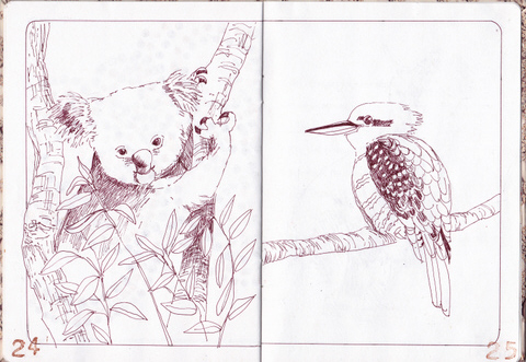
                                   Koala at Lone Pine sanctuary                Kookaburra


            Mother Kangaroo with her Joey


Leaping Kangas with the Australian Flag


Uluru


Now with a week to go before the postmark deadline it’s complete. 

The last few pages have been scanned. It's hard to stop, but it's time to say -  that’s done - and put it in the post.


Thursday, 12 April 2012

The Sketchbook Project Limited Edition Vol.1


A few months ago I saw some sketchbooks done by artist friends. These were part of The Sketchbook Project 2012. I’ve kept sketchbooks as long as I can remember. Mostly, they’ve been travel sketchbooks when I’ve had time to sit and draw. One thing I’ve never done is a sketchbook with a single theme, designed, planned and executed from cover to cover.
The idea intrigued me. I was too late for the 2012 project as entries were fully subscribed and in any case there was insufficient time to complete the project.

However, a new project had just opened. The Sketchbook Project Limited Edition Vol.1 is a collaborative series of art books created by 5,000 artists from around the world. I signed up, chose my theme and waited impatiently for the sketchbook to arrive in the post.


The cover pays homage to my Mother - it features an example of her masterful crochet work. I took a direct scan from a tablecloth she made.


The theme I chose was Thread and Surface. The opportunity to explore mixed media in the project excited me. The sketchbook duly arrived. I must confess to a little disappointment initially. I knew what size the book would be but I soon realised that the paper would not stand up to any dramatic media exploration. In fact, even a light watercolour wash was tricky.

So - a change of plan was needed. I know what you are thinking - just replace the paper with something more suitable - thicker more robust paper. Since making hand bound journals is not one of my accomplishments, and because my frugal nature baulked at throwing out the original pages, I decided to work with what I had.

My initial concept was to use the idea of thread as the thread of my life - tracing my life from surface to surface in South Africa and finally from continent to continent as I moved from Africa to Australia. As I view my life here I am often in a contest between the two places. Part of me is here, happy in Brisbane; part of me remains and always will remain in South Africa.

I recently read a book by Rachel Powers called The Divided Heart: Art and Motherhood : a divided heart: a split self; the sense that to succeed at one means to fail at the other. 
There's the dilemma faced by an artist when she becomes a mother. There’s the strong maternal pull to bond with your child and there’s the need to separate oneself from the child in order to create. In my case it was a little different; my children are grown up but I was leaving part of my family to live a creative life in another country, so it seemed to be a fitting title for my Sketchbook.


Two Continents

When I drew the maps I was taken back to Geography class many years ago - my favourite part was adding blue sea around the land.


Part  2 to follow:
My heart is in two Countries - I discuss the planning and process